New!

Space Age Design
Midcentury Futuristic Atomic Googie Jet Age

<500+ Images
<19 Categories


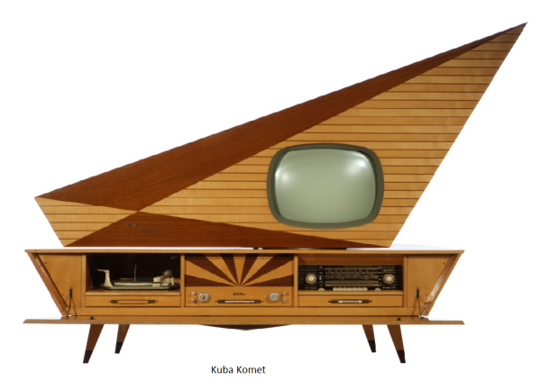
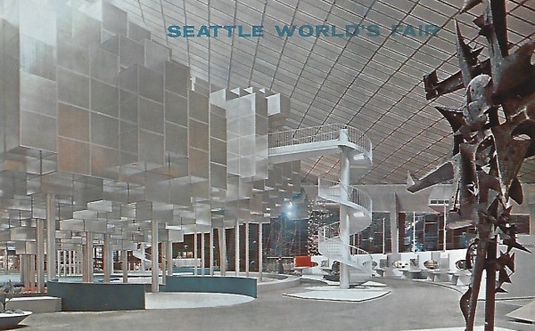
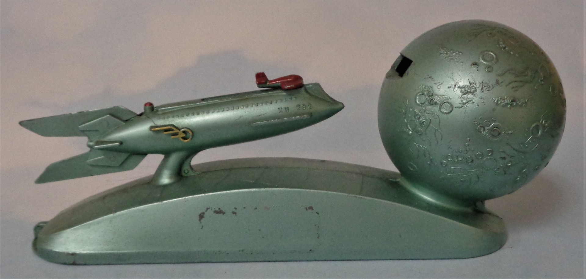
Midcentury Futuristic Design is bright, angular, and attention grabbing. It can also be humorous, weird or whimsical. Often called Space Age, Atomic, Googie or even Jet Age. It dates to around 1954 - 1964, a very optimistic forward looking age. Since Midcentury Futuristic Design is a mouthful, the term Space Age is used here primarily. This is a new site dedicated to Space Age design. Most of the over 500 images are items, postcards or ads from my personal collection. The exceptions are most of the concept cars and roadside signs, and include the three images above, but none below. If you have images you would like to share, comments, corrections etc., please email to me at popcultcha2@gmail.com.
Images of the future driven by scientific and technological advances have been a part of our popular culture since the late 1800’s. Many of these images involved science fiction, including space travel, at the time considered the most advanced futuristic technology. It started with novels by foreign authors such as Jules Verne who in the mid-1800s wrote novels such as Journey to the Center of the Earth, From the Earth to the Moon, and Twenty Thousand Leagues Under the Sea. In 1885, H.G. Wells wrote The Time Machine. These were followed in the early 1900s by futuristic movies such as Un Voyage Dane La Lune in 1902, one of the first movies ever made, about voyage to the moon. In 1927 came the futuristic movie classic, Metropolis. World’s Fairs drew millions of visitors by showing the latest advances and images of what the future might look like. The future really took off in the 1930s, when the depression made people want to forget the present and look to a better day. That is when hobby magazines such as Popular Mechanics started showing futuristic vehicle and gadgets on their covers. Advertisers started using images of the future in their ads. Serials such as Flash Gordon and Buck Rogers could be seen at the movies.
Around 1950, our use of the future in popular culture changed. No longer were we trying to escape from the present. Hard times from the depression and the war were over. Suddenly, the future seemed bright. The middle class swelled. Parents expected their children would have a better life and pushed them to succeed. Numerous innovations changed how we lived and promised a better tomorrow. These included space exploration, jet airplanes, computers, medical advances, atomic energy, interstates, television, supermarkets, better plastics and increased travel. Designers, advertisers and architects realized the visual lure of the future was an important marketing concept. Some of the innovations were used so much by designers, advertisers and architects, that their names are now used to describe the age. The terms Space Age and Jet Age were used back then.
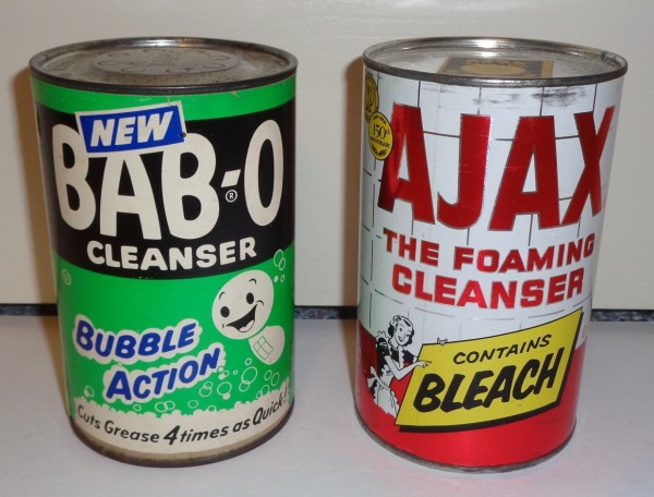
Disney took advantage of the fascination with the future by creating Tomorrowland as part of the first Disney World opened in 1955. Exhibits included a plastic house of the future by Monsanto. The 1950s were also the heyday of American science fiction. Colors used in interiors, appliances, cars, buildings, signs and other items became brighter in response to the drab colors of the war years.
American Midcentury futuristic design is known today by several different names, primarily Space Age, but also Jet Age, Atomic, and Googie. The first three refer to innovations during the time period that just a few years earlier were science fiction. Googie is Space Age design for buildings. Midcentury Futuristic Design (or Space Age) is bright, angular, and attention grabbing. It can also be humorous, weird or whimsical. Space Age was considered ultra-modern at the time. Products using Space Age design were often made of newer lighter materials such as plastics and chrome for consumer products and stainless steel, fiberglass and more glass for buildings. It was very commercial and often used by businesses to draw attention to themselves. Space Age design was heavily used in the architecture and signage of restaurants, motels, car washes and bowling alleys. Advertisers used it in magazine ads, signs and billboards. American automakers heavily utilized Space Age design, particularly from 1958 to 1962. In an ad or sign it is often so exuberant, that it appears to jump off the page. Advertisers of discretionary products like soda in particular liked it. It was used occasionally in products such as clothes, furniture, housing, appliances, and household products. Its heyday was the 1954 to 1964. However, elements of Space Age design are still used today.
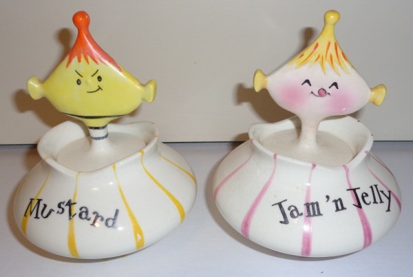
Perhaps nothing influenced design from this period more than space exploration. The viability of space flight started with a paper published in 1919 by American, Robert Goddard. During World War II, German scientists developed unmanned rockets as weapons that could fly hundreds of miles. It was a German V-2 rocket, that became the first to reach space in 1944. In 1957, the Russians launched Sputnik 1, which became the first man made satellite to orbit the earth. The Russians followed this up with Vostok 1 in 1961, which became the first manned space flight. American rocket research in the early 1950s centered on rockets used as weapons. Space travel in America went from fantasy to serious with Disney’s Man in Space television program in 1955. In 1958, President Eisenhower created NASA to focus on space exploration. President Kennedy gave a widely followed speech in 1961 promising to put a man on the moon that decade. Space Age design included sleek rocket like designs, starbursts, Sputnik-like lamps, and cartoons like the Jetsons.
Also influencing Space Age design was the invention of the jet engine. The first jet engines were created by the Germans during World War II. By the 1950s, most new fighter planes had a jet engine. Commercial aircraft followed, becoming widespread in the early 1960s. The jet engine revolutionized travel, making it quicker, easier and safer to travel long distances. Jet Age design can be seen in the design of some automobiles from 1958 to 1962 where the tail lights or grill often looked like a jet engine.
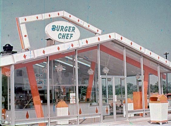
The atomic age was influenced by advances in atomic energy and research and fears about atomic weapons. It was also influenced by modern art by artists such as Jackson Pollack, Alexander Calder, and Pablo Picasso. Pollack’s drip paintings and Calder’s curvy forms were turned into abstract atomic patterns. Atomic particles and modern art influenced geometric designs that were found in architecture, curtains, vinyl top kitchen tables, counter tops, dishware, glassware and wallpaper.
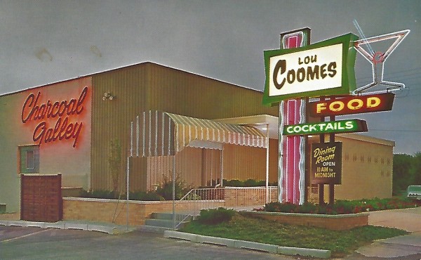
Googie is an architectural style named after a coffee shop in Los Angeles. The term is not used much today, as it is an unappealing term, originally meant to be derogatory. But usage of Googie style architecture was extensive. Starting in Southern California, it spread to Las Vegas, then to the rest of the country. It was bright, angular and particularly attention grabbing. Elements of it could be floating, soaring or gravity defying. It was partially a result of a new age of American travel. Futuristic and garish signs and architecture were used by restaurants, motels, car washes and bowling alleys to pull travelers off of the road. It was perfect for the youth car culture of the time. The original McDonalds was pure Googie style. Surprisingly, Googie was also extensively used by banks who were trying to change their image from intimidating stodgy institutions, to one more welcoming to the public. Churches of the era were eager users. Googie was considered kitschy by many established architects and critics of the day due to its commercialism. The elites preferred the European minimalism of the era. But the public voted with its feet and were drawn in by it. Today it is better remembered than most other styles of the day.
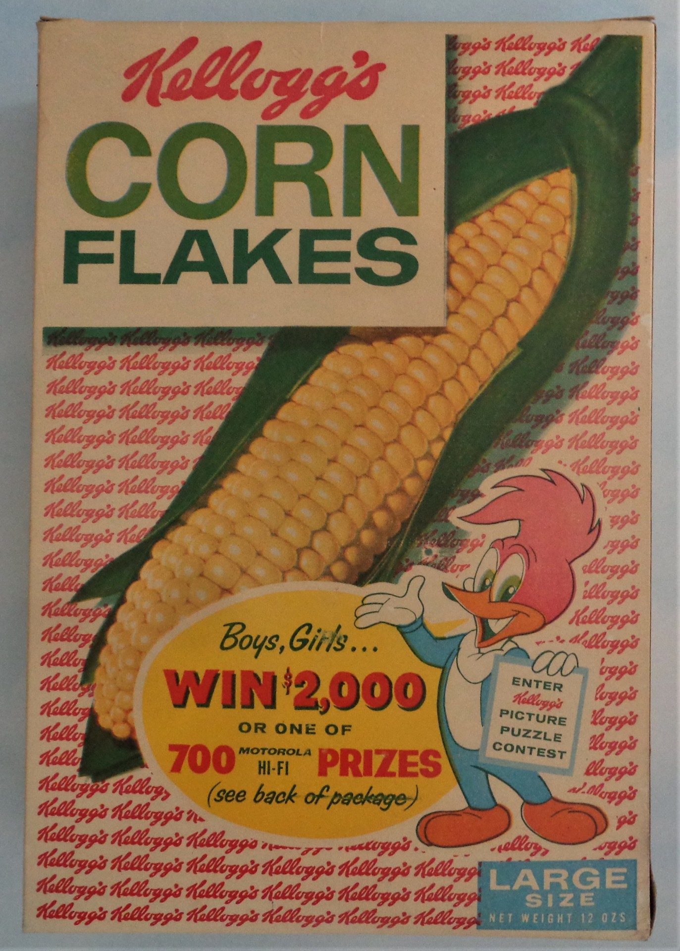
Industrial design has in its golden age in the 1950s and early 1960s. Designers often became as important as engineers and scientists. Consumers suddenly had money to spend and expected stimulating new and improved products to buy. Luxury items today became standard in the next year’s model. Products that were sold loose over the counter now came in packages. Product packaging needed better, brighter and more attention grabbing graphics. Packaging came in new materials such as plastics and new forms such as the aerosol can.
American culture changed abruptly in the mid-1950s with the advent of rock and roll. Teenagers and young adults now had their own music and were increasingly catered to by advertisers, television and the movies. Magazines geared to teens appeared. It was the teenagers and young adults who most eagerly adopted midcentury styles. Their homes had modern looking furniture while their parents bought revivals of earlier styles.
American culture also became more American, driven by our own designers, architects, movies, television and advertising. The biggest foreign influence was Scandinavian design for furniture. However most cars, homes, commercial buildings and consumer products were uniquely American. Due to our prosperity, American culture was also exported like never before.
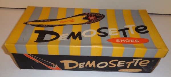
We became more mobile. People were moving in droves from the inner city to the suburbs. This affected the country in many ways from developing a car culture, to increasing home ownership, to providing stability. More people had cars which were more reliable and had much more horsepower. For the first time you could use a drive in for a restaurant, bank, movie or even to worship god. Radios became mobile with the advent of the transistor radio. Increased travel led to more motels, restaurants, billboards, car washes and gas stations. All of these heavily used Space Age design to pull people off the road.
Space Age design took design and commercialism to an extreme that has not been repeated since. The only time-period of similar extremes was the late Victorian Age when design of homes, commercial buildings, furniture, women’s clothes, and advertising became very busy and ornate. Space Age design was preceded and influenced by the Streamline Moderne design of the late Art Deco period. Streamline Moderne was characterized by long lines and curving forms. I include some of the 1950s and early 1960s Japanese tin toys as Space Age. The Japanese after World War II eagerly absorbed American culture, added their own twist, and sold it back to us.
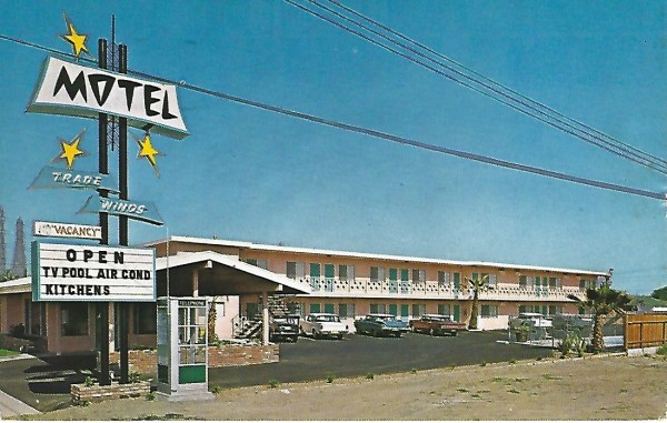
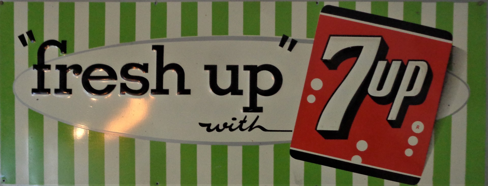
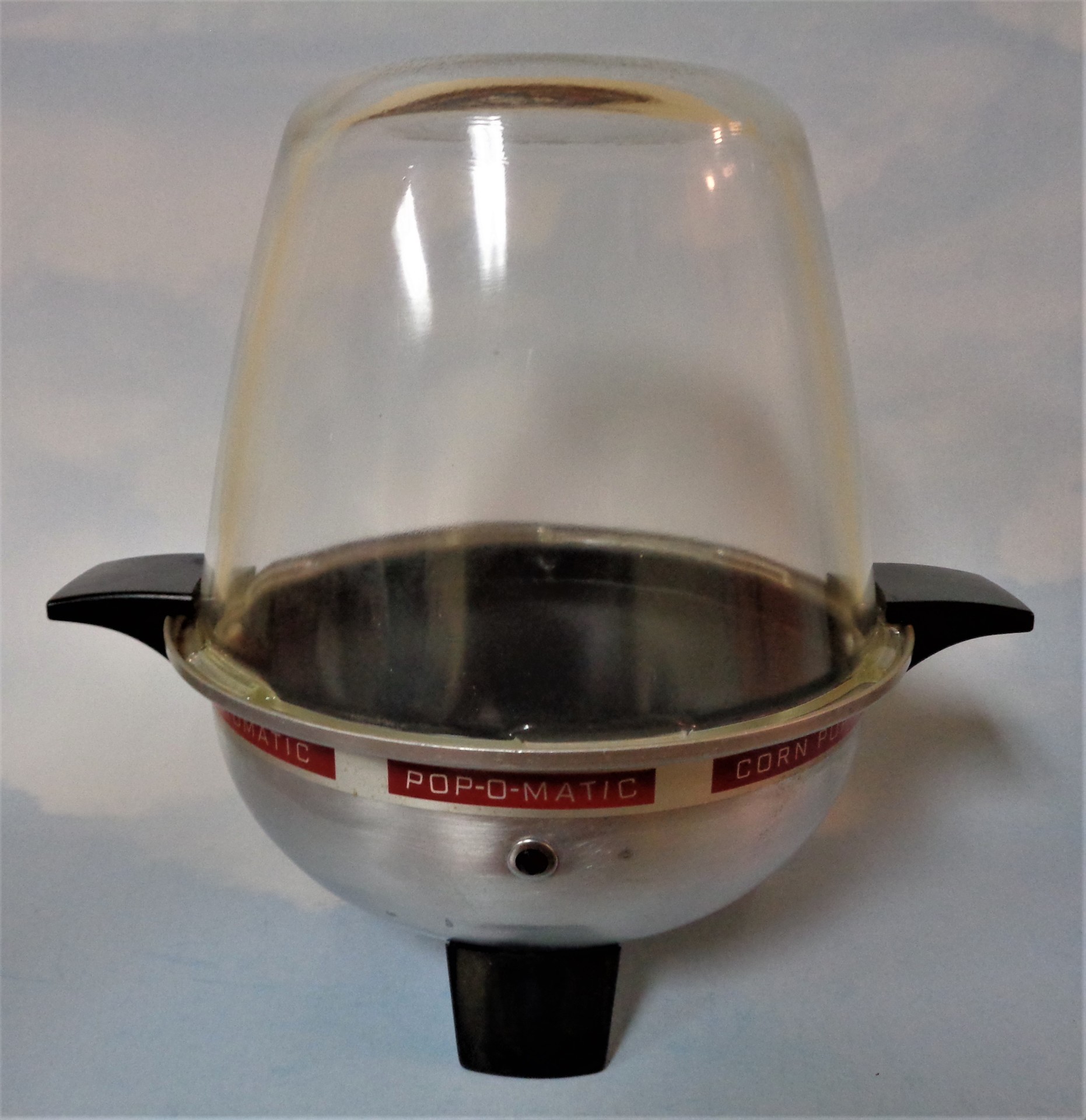
This web site features images of Space Age design across many categories. It was most used in commercial architecture and signs. Some of the custom made homes of the era were very futuristic. In fact there is a fabulous magazine today called Atomic Ranch dedicated to midcentury homes. Some of the most extreme usage of Space Age design was American car prototypes of the 1950s and early 1960s. GM, Ford and Chrysler produced numerous concept cars designed to awe car show attendees and whet their appetite for future models. Components of these prototypes were often put into production models a few years later. Some household appliances such as radios, vacuum cleaners, and televisions used Space Age design. One of the most fun sections of this website is food and household containers. The new supermarkets were much larger and better lit than the small corner grocery store they recently replaced. An attention grabbing design was needed due to the huge expansion of shelf space to attract shoppers. The best known Space Age television show of the era was the cartoon The Jetsons, about a futuristic family. While the show only lasted one year, its futuristic style has remained iconic. Other futuristic shows of the era were; Science Fiction Theatre 1955-1957, Out There 1951, Tales of Tomorrow 1951-1953, Men into Space 1959 and Twilight Zone 1959-1964.
Space Age was far from the only design of the 1950s and early 1960s. Scandinavian design which emphasized simplicity, minimalism and functionality was heavily used in furniture. Italian design also influenced furniture and glass. Colonial revival was seen in homes and furniture. A South Pacific style known as Tiki had appeal. The Europeans also used futuristic design though their designs were more stark, less flamboyant and whimsical.
The Space Age came to an abrupt end right around 1964. The architectural design in particular was expensive, often impractical, and overly flamboyant for the age that followed. The age of optimism, from 1950-1964 was succeeded by an age with a harder edge. President Kennedy, a beacon of hope for the future, was assassinated in 1963. Protests developed due to disillusionment with the Vietnam War and a push for civil rights. The music became less pop oriented, louder, and more electric guitar based. This was epitomized by Bob Dylan going electric at the 1965 Newport Folk Festival. Movies did not always have a happy ending. Feel good terms from 1950-1964 such as swell and gee whiz were laughed at. Design became earthier and occasionally machinelike. Hairstyles became longer and more unkempt. The remaining optimism was squashed by the Watergate scandal in 1972 when many Americans lost faith in the government.
